
For those of you that want an easier way to understand the differences between microinverters (such as those manufactured by Enphase or APS) and DC optimisers (such as Solar Edge or Tigo), and don’t want to read this long post I published a couple of weeks ago then this 2 part infographic is for you!
The first part explains the difference between conventional, string inverter systems, DC optimised systems and microinverter systems (seasoned solar nerds may want to skip this and scroll straight down to part 2)
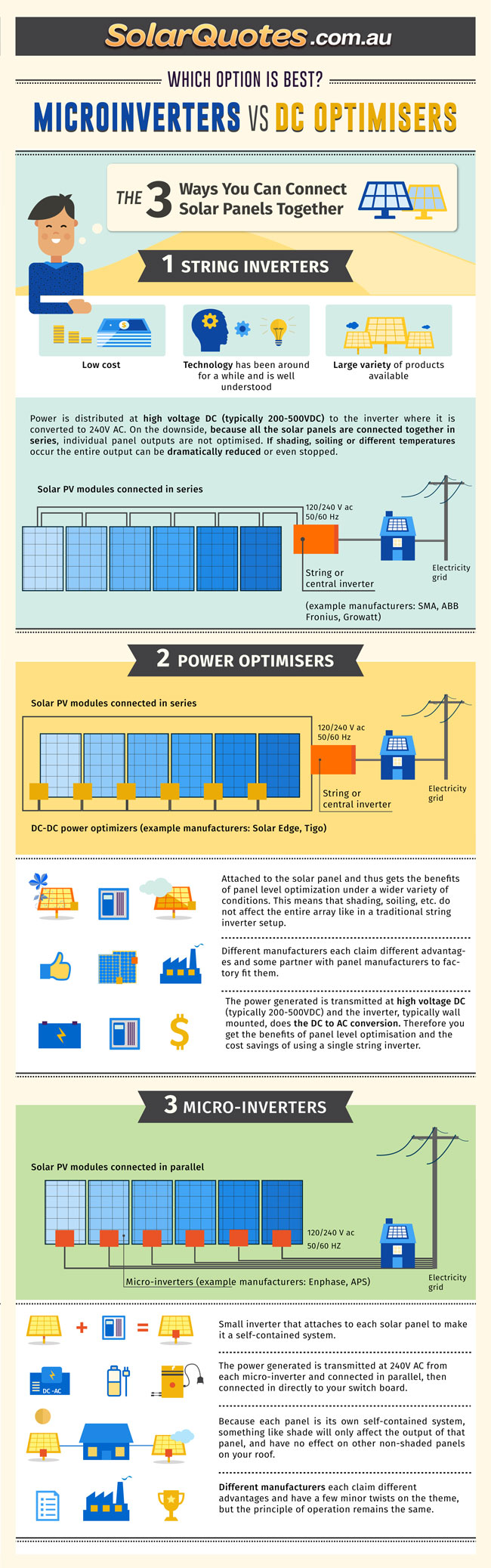
Microinverters vs DC Optimisers. Part 1
Part 2 goes into the pros and cons (and even picks a winner based on my humble opinion).
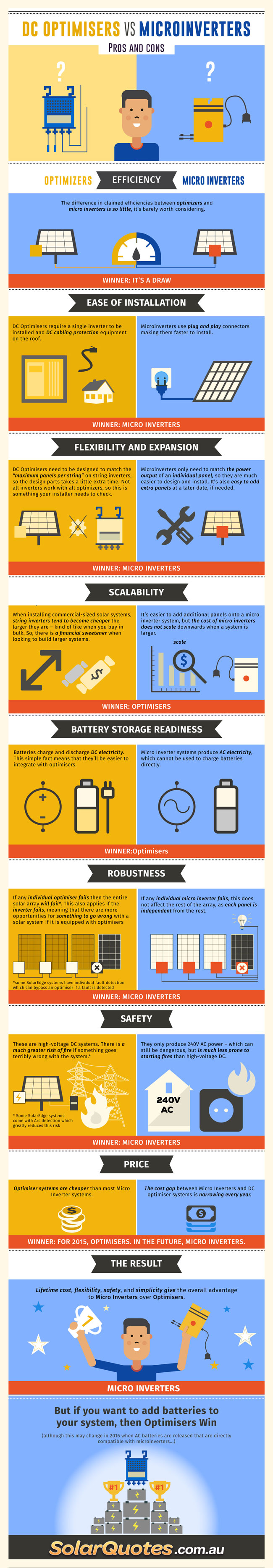
MIcroinverters vs DC Optimisers. Part 2
If you want to republish any of these infographics, no worries. All I ask is that you link back to this original post. I also have higher res versions which I can provide. Just ask!
* Note: the 2nd graphic has been updated to include 2 features of full Solar Edge systems (i.e. systems with Solar Edge optimisers coupled to Solar Edge Inverters) . Specifically Arc protection and individual fault bypass circuitry.
** This is only an opinion! If you vehemently disagree with my analysis, please leave a comment, or even write a well articulated blog post with your differing opinion, and I will happily publish it.


 RSS - Posts


Currently Raging Debates: