
The Australian Energy Council publishes a report on solar every quarter. I’ve just read through the latest one. There are only 11 pages of text and graphics, so it’s not too much of an effort if you want to read the whole thing yourself here.
But since we live a world where everyone is as busy as bees — except for people stuck at home in Melbourne — I’ll make use of my surplus of serenity by summarizing the report.
The report says:
- Rooftop solar power system installs are still going strong.
- Home battery installations have dropped.
- Midday power from solar panels in the eastern states increased by almost 40% over the past two years.
- Solar farm construction is way down this year compared to the previous two but expected to boom soon.
- Payback time for rooftop solar is best in Adelaide and worst in Darwin.
What Is This “Australian Energy Council” Of Which You Speak?
The Australian Energy Council, or AEC, represents 22 electricity and natural gas companies that:
“Sell gas and electricity to over 10 million homes and businesses.”
That’s a lot considering there’s only 10 million homes and perhaps 2.3 million businesses in Australia. But I wouldn’t be surprised if they are double-counting those with both electricity and gas.
What the AEC say they do is this:
“Utilising our extensive networks across media, industry and government, we are proactive in public debates and use this platform to promote key strategies, inform consumers, defend the industry against unwarranted or incorrect criticism and advocate for the industry generally.”
So, apparently, they schmooze. But what they’re famous for is having a logo that looks like three fluorescent bananas stacked on top of each other:
I suppose it could represent someone smearing coal dust off a window to let the sun shine through, but that might be a little too imaginative.
Rooftop Solar Power Still Going Strong
The report starts off by telling us rooftop solar is still going strong despite the pandemic. I can back up the AEC on this. If there had been a slowdown we’d definitely know. There was concern earlier in the year about supply chains being disrupted, but that’s in the past now and reduced world demand means China and other nations are trying to shift as much solar hardware as they can, pushing down prices. While the Australian dollar isn’t strong, the fact it’s the highest it has been for a year helps.
The first graph in the report shows small scale solar installations of 100 kilowatts or less are up and the average solar system size has been increasing:
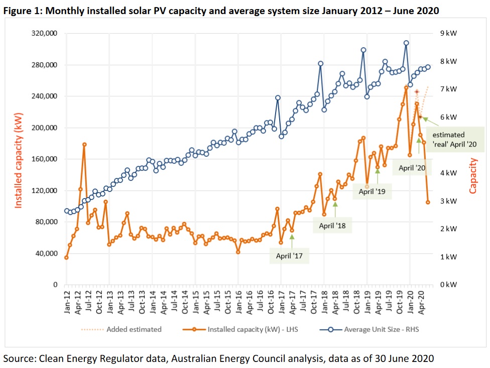
The orange line shows the total capacity of solar systems of 100 kilowatts or less installed each month. While it looks like the orange line falls off a cliff at the end, that’s a quirk of the data and they’ve added in a dotted line showing an estimate of what it’s likely to be.
The information comes from the number of Small-scale Technology Certificates, or STCs that have been created when solar is installed on roofs. The Clean Energy Regulator administers Australia’s Renewable Energy Target and says 11.4 gigawatts of small scale solar power systems have been installed since the scheme started. This table from the regulator gives information on the number of small scale renewable energy installations and total kilowatts of capacity, straight from the horse’s mouth:1
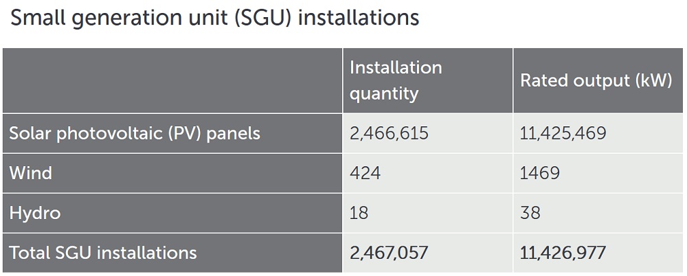
But the 11.4 gigawatt figure for solar power — or 11,426,977 kilowatts if you want to be picky — is only a record of the total amount installed so far. The AER report doesn’t mention that much of this has been lost. While some of the capacity would have been retired for good reasons, most of the loss has been due to the installation of crap solar. Far too many PV systems installed in this country have been cheap and shoddy — or worse, expensive and shoddy. As a result, we do not have 11.4 gigawatts of small scale solar installed. It’s going to be significantly less.
While we’re slowly winning the fight against shonky solar installers, continued vigilance is necessary. Don’t go with someone simply because they’re cheap. Check reviews to see if they do quality work and support customers if something does go wrong.
Average System Size is 8 kW
The graph above (no, further up — that grey thing isn’t a graph, it’s a table) shows average system size as a blue line and puts it at just under 8 kilowatts. It has doubled over the past 7 years. But this includes large commercial installations as well as residential. As Michael pointed out in our Australian Solar Systems Interest Index at the start of August, this July was the first month in which the number of households seeking systems over 6 kilowatts exceeded those looking for 6 kilowatts. This means the mainstay of the residential market is still 6 to 6.6 kilowatts, but we can confirm the average size has been heading up.
Home Battery Installations Are Down
According to the quarterly report which — once again — uses information from the Clean Energy Regulator, residential battery installations in the first half of this year are less than half the total for 2019:
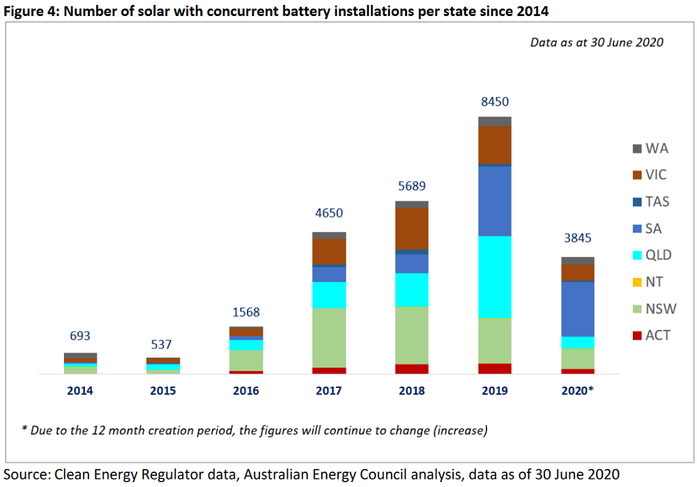
If we assume the same number of batteries will be installed in the second half of this year as the first then the total will come to 9% lower than last year. Price decreases and decent offers from Virtual Power Plants (VPPs) could turn this around. Although, the recent reduction in the South Australian battery subsidy will hurt SA battery sales. SA has 46.6% of home batteries but only 7% of the population, so what happens in the Festival State can have a big effect on national figures.
The decline is not surprising as home batteries still aren’t financially worthwhile for normal households and the majority of early adopters who don’t mind this already have one.
NEM Noon Solar Power Up Nearly 40% In Two Years
In the National Electricity Market or NEM, which is all states except WA (and the Northern Territory), the amount of solar power provided in the middle of the day has increased by almost 40% over two years. This graph shows average power supplied through the day by large and small scale solar in the NEM during the second quarter for the last three years:
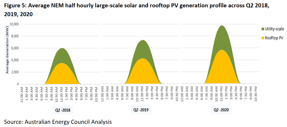
That’s a whole heap of power, especially considering the second quarter (autumn/winter) is the worst for solar energy generation. Last Thursday the NEM at noon was drawing a total of 21.5 gigwatts of grid electricity. So if solar was supplying its average, 36% of all electricity consumed was coming from solar panels at that time.2 That, more or less, represents power that otherwise would have been generated from fossil fuels. So it’s a damn good thing it’s increasing.3
Solar Farm Construction Down
As the graph below shows, large scale solar farm construction in Australia wasn’t very significant until the second quarter of 2018. That’s when we entered a renewables mini-boom and the commissioning of solar farms really took off. But for the first two quarters of this year — while construction isn’t as slow as three years ago — the mini-boom appears to be over:
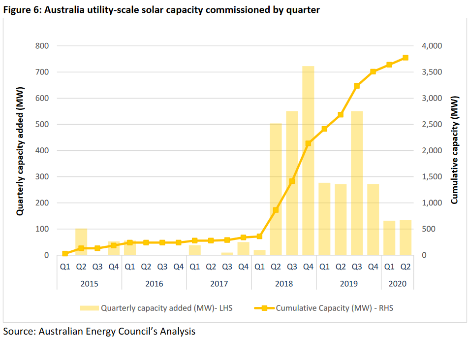
The value of Large-scale Technology Certificates, or LGCs, that those solar and wind farms create is expected to drop rapidly over the next few years, so a decline in construction was predicted. But how much of the decline in solar farm construction has been due to the poor outlook for LGCs and how much as been the result of the pandemic is difficult to say.
Future Solar Farm Construction May Be Massive
While the number of solar farms currently under construction has taken a tumble, the amount being considered is massive. The graph below contrasts what’s being built now with has been publicly announced in the NEM:
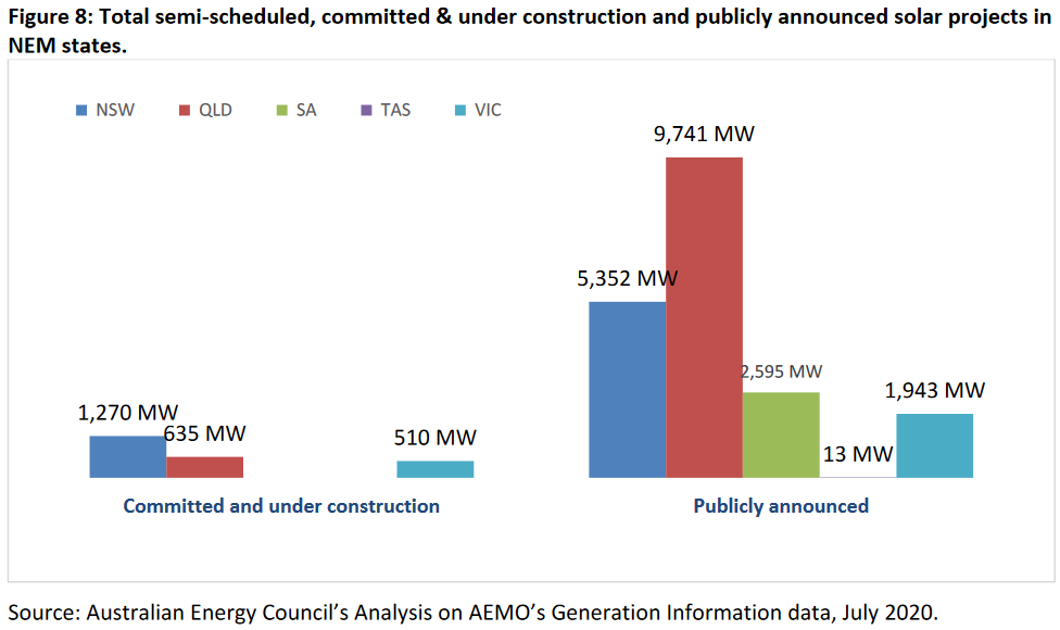
The announced amount comes to 19.644 gigawatts, which is eight times the 2.415 gigawatts under construction now. To put it into perspective, I made this table showing the amount of generating capacity in the NEM last financial year:
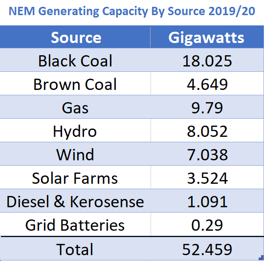
If all the announced projects go ahead, the new solar farm capacity will be more than Australia’s current black coal capacity. If half is built it will still be twice the brown coal capacity. While one gigawatt of solar farm capacity will only produce around one-third as much energy as one gigawatt of coal generation currently does, if only one-third of the nearly 20 gigawatts of proposed solar farms are built it will still be more than enough to cause problems for Australian coal power.
While it’s not possible to know how many of the proposed solar farms will go ahead, it is likely to be a lot. The way these things generally work is many will be cancelled, but there will be additional new proposals as time goes by.
Rooftop Solar Payback — Adelaide Amazing, Darwin A Downer
In the final section of the report, the AEC gives the results of their payback calculations for rooftop solar panels in capital cities. According to them, Adelaide has the best payback time, while Darwin has the worst. This is a tragic result for Territorians, as Darwin is the capital with the second-highest output for rooftop solar. Perth just manages to beat them with around 3% more generation from identical north-facing solar systems.
The reason why Darwin does so poorly is because they have the highest installation costs in the country and the NT solar feed-in tariff has recently been slashed from Australia’s only one-to-one tariff equal to the cost of grid electricity, to just 8.3 cents per kilowatt-hour.
This graph shows the payback times for 3, 4, and 5 kilowatt solar systems:
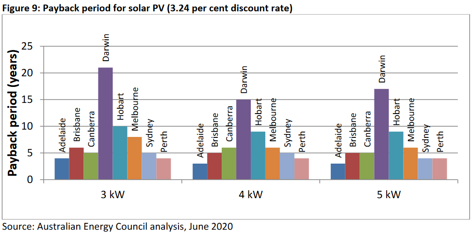
For a 5 kilowatt system, Adelaide comes in at around 3 years. Most of the other capitals can pay for themselves in 5 years or less. This would include Melbourne if the Victorian Government’s $1,850 solar rebate is included, but that hasn’t been accounted for in this calculation. Hobart has the second longest payback period due to low levels of sunshine on the Apple Isle and higher than average installation costs.
The graph doesn’t show simple payback periods, which are called ‘simple’ because they are just how many years it takes for savings on electricity bills to equal the cost of the solar system. Instead, the results on the graph above take into account the time value of money by using a discount rate of 3.24%. While some would say I’m putting this too… simply… that’s roughly equivalent to having a home loan you could put money towards instead of investing in solar panels.
Things get interesting if the discount rate is increased to 5.87%, as it causes the results to get kind of crazy for Darwin and Hobart with the payback period in both capitals being given as over 30 years, as shown in the graph below:
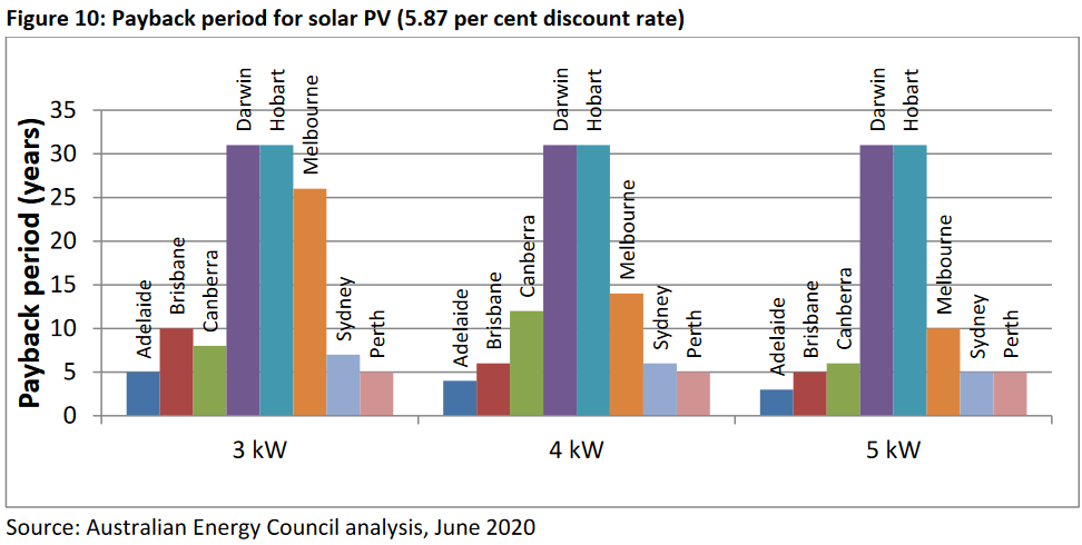
While I haven’t bothered to try to replicate their calculations, I suspect this actually means that — according to their model — rooftop solar power will never pay for itself in these two cities. But, as you can see, in the other capitals the payback periods for a 5 kilowatt solar systems are far less affected by the higher discount rate.
If you live in Darwin or Hobart and suspect your discount rate is high, these results don’t mean it doesn’t make sense for you to get solar panels. I recommend getting some quotes from installers who do good work and, to work out if solar is a good financial deal for you, estimate your likely savings and compare them to whatever alternative investments you could make. And if it’s still unclear after that, then get solar power anyway because it’s good for the planet. I know the crab people are waiting for us to destroy ourselves so they can take over, but as far as I am concerned they can just keep waiting.4
That’s All, Folks…
And that’s the highlights from the report. I’d like to thank the Australian Energy Council for fitting it all into 11 pages.
Footnotes
- The Clean Energy Regulator has a horse’s mouth with a speaker in it. It’s really quite creepy. ↩
- If that 36% figure seems odd, it’s because rooftop solar generation is consumed without being counted as grid power, even if some or all of the energy produced by a rooftop solar system is sent into the grid for a feed-in tariff. ↩
- Solar normally doesn’t displace other renewable generation — yet — because water in hydroelectric dams can be saved for the evening and wind power has no fuel cost. Its marginal cost is lower than gas or coal generation, so they tend to get driven out of the market first. ↩
- If you mail me photographic evidence that you are a crab person, I’m willing to send you a book of crossword puzzles to help pass the time. ↩
 RSS - Posts


Speak Your Mind