
What do you get if you put a 3D mapping expert, a coder, an incurable data nerd, and a proud owner of a one-year-old rooftop solar power system in the same room?
You get John Corbett of course! He is all of those things and more.
Using a combination of solar monitoring services, drone-based photogrammetry, and lots of hand-written 3D and time-series analysis he has been busy compiling data from his rooftop solar to share with the world.
Although John has more tools in his arsenal than your average Joe, he reckons all this data wizardry is not only a way to satisfy his number noodling addiction, but also proves how useful detailed solar monitoring can be for mere mortals like you and me.
Exploring John’s Advanced Solar Monitoring Toolkit
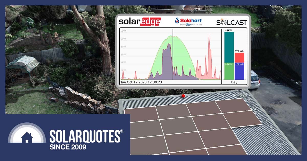
In November 2022 he had installed 18 x 400 W Solahart Suncell solar panels (7.2 kW), each fitted with a Solaredge power optimiszer, and a Solaredge 6000 W Energy Hub inverter. The optimizers allow John to have individual panel level monitoring, viewable in his mySolarEdge app along with household energy consumption data.
In addition, being a computer programmer, he has written his own code which imports various data streams including the SolarEdge API, and a solar forecast provided by the Solcast irradiance prediction API, and displays them on his own custom-made graphs.
But that’s not all. Did I mention that John used to run the 3D mapping division at Nearmap? His extensive experience gives him a valid excuse for flying the latest high-tech drone above his house collecting photogrammetry data and building fancy 3D animated gifs of the sun circling above his solar panels.
The 3D animations1 John produces use actual recorded solar production data to show how his optimizers handle the partial shadow conditions. The visualizations show panel colours changing to reflect their power output – blue being low through to green showing a high output.
This might all sound like fun and games, and it is, but John assures us that it’s also serious work that validates his solar investment. At least that’s what he tells his wife 😉 So, let’s drill down and find out what he’s achieved over the last twelve months.
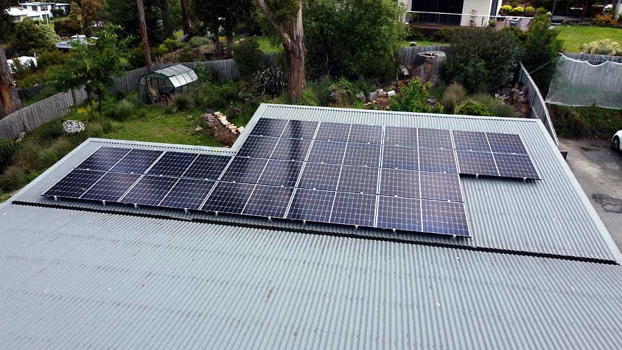
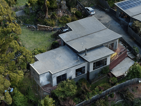
John’s shiny twelve month old 7.2 kW rooftop solar array.
Optimising Solar Panel Layout With Drone Photogrammetry
“Using detailed shadow prediction, I was able to work with the installers to get a much better system layout before installation.”
Solar Installations in Tasmania can be challenging. John’s was no exception. His roof pitch is not optimal for his latitude (Hobart) – at only about 8 degrees, and there is shade from a large tree. In addition, Mt Wellington kills his afternoon sun.
He used SolarQuotes service to get three free quotes, settling on Solahart Hobart to do the job. John can’t speak highly enough about this company, as their site inspection prior to quoting included close to four hours of the installer’s valuable time going through the family’s energy needs, as well as sizing the PV system.
John’s house features a gull-wing roof, which slopes towards the middle into a central gutter, contrasting with traditional roofs. This unique structure may not be obvious in 2D aerial images and could easily be mistaken for a standard roof. Without an on-site inspection, there’s a risk of installing panels on less optimal parts of the roof.
The initial layout of the solar array proposed by Solarhart Hobart ended up being fairly close to the final position on install day. However, after analyzing his 3D photogrammetry data John was able to tweak it to achieve a better outcome.
Rather than the array being one big rectangular block, they were able to shift a few panels sideways resulting in more of an ‘S’ shape and avoiding some of the more severe shadowing. See the initial quote layout, followed by an animated gif of the actual installation.
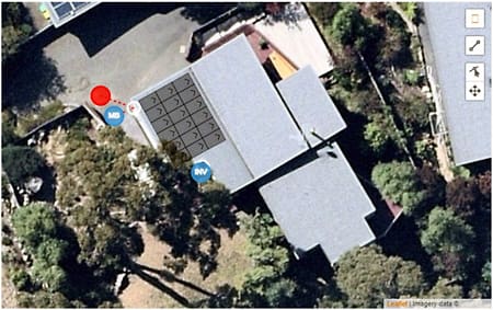
The proposed solar array layout in John’s original quote.
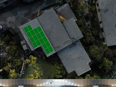
The final array layout after John’s 3D photogrammetry tweak.
Admittedly John has more tools available to him to do a shading assessment than us, or even the average solar installer. He went to the nth degree, flying a drone around, taking hundreds of photos, and running them through specialised 3D construction software.
He recommends for someone without access to this software (the rest of us) Google 3D Tiles is a pretty good alternative. There may be a slight learning curve but it’s free.
Diagnosing Over-Voltage Issues
“We were able to diagnose a distribution network over-voltage issue on the local transformer that allowed myself and all the neighbours in the area to increase our day-time solar feed-in significantly after it was fixed.”
From my conversation with John I can’t confirm that the over-voltage problems were due to the transformer, or his, and other rooftop solar systems in the vicinity. Either way, his eagle eye did spot the anomaly which led to the DNSP adjusting the transformer tap settings, rectifying the problem.
By observing his monitoring app John noticed that on a perfect sunny day, soon after the hot water system had got up to temperature, the inverter would trip rather than sending excess energy into the grid. The inverter would then reset and come back online after 15 minutes or so.
John was puzzled, so he passed this information on to the installer, who looked into the problem. They came back to him with a graph of the detailed inverter data indicating the AC voltage reaching the inverter over-voltage set point and indeed shutting it down, resetting, and repeating soon afterward.
The installer forwarded the data to TasNetworks who fortunately were very responsive. They promptly installed data-logging equipment in John’s switchboard to confirm the over-voltage suspicions. After a couple of days, they said the local distribution transformer needed a tweak, and then less than a week later all was done.
John’s inverter has been behaving itself ever since. He can see from the before and after graphs that his exports have increased significantly since the above events and suspect the solar owners in the neighbourhood have benefited the same.
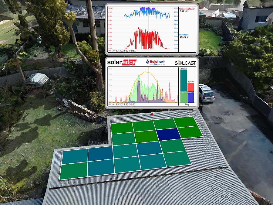
John’s custom solar monitoring showing over-voltage events prior to the intervention. The green shaded graph indicates AC power from the inverter frequently reaching the trip point and resetting soon after. The panel output colours are all over the shop because the panels were turned back on with different timing after each inverter reset. The overall daily production is well below the yellow SolCast curve, whereas it should have been tracking it closely if everything was working properly.
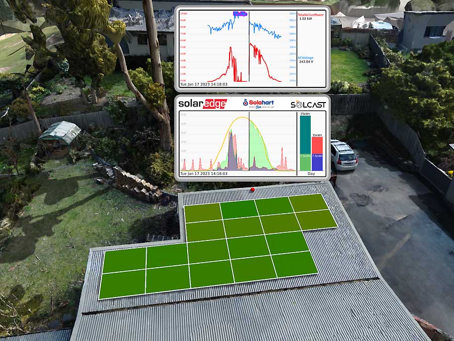
Same as above but showing the logging for the day that TasNetworks fixed the transformer settings. After a few hiccups over a couple of hours, everything came good and you can see the nice green production curve that now tracks the SolCast prediction perfectly during the afternoon.
Detecting and Addressing Solar Panel Damage
“The per-panel output monitoring alerted me to the fact that a large branch had stabbed itself through the heart of one of my panels while we were on holiday.”
When reading the above statement I initially thought John was checking his rooftop solar on his phone while he was on holiday. He’s since told me that although he’s a data nerd, his addiction isn’t so extreme as to interfere with his holiday, and only discovered the destruction after returning home.
Due to the gull-wing roof construction on his house, the solar panels aren’t visible from the ground, so any damage can only be picked up by monitoring software – apart from the smell of burning electrical components of course!
John’s panel level monitoring immediately indicated that one solar panel was only producing half its regular output, and prompted him to take a closer look, discovering the damage seen in the pic below.
So, without DC optimizers and panel-level monitoring, this would have been much harder to diagnose unseen and may have easily gone unnoticed for six months or a year.
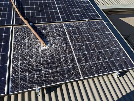
Tree branch free-diving at John’s place.
Animation of the per-panel outputs indicating a problem (the smashed solar panel). The top left panel is constantly less coloured than the rest, showing a much lower output.
Uncovering A Hidden Hot Water Leak
“A small uptick in the overnight hot water energy usage led to the discovery that rats had chewed through a hot water pipe which was now spraying water inside the walls of the house.”
Similar to his revelation of the tree branch free-dive into his solar panel above, John’s keen observation of the production and consumption monitoring led to the detection of the next house-wrecking attempt by nature.
His decision to move to a TOU (time-of-use) tariff after installing solar meant that the hot water system was shifted from the off-peak tariff to the TOU as well. This enabled him to be able to visualize consumption data for everything in his house, including the hot water system, which was among the hungriest appliances.
Seeing an unusually higher-than-normal energy consumption rate led him to investigate, and soon discovered that hot water was escaping through a small hole that he presumed rats had chewed through. The leak, being under the house, may not have been discovered for quite some time had it not been for hot water being shifted to TOU tariff visible with his consumption monitoring.
Photographic evidence from John the solar detective proving the rat guilty as charged.
Better Living Through Data
“As a household, we are now much more aware of how our behaviour affects our energy consumption and have actively optimised our lifestyle to minimise our burden on the grid.”
I asked John if his family has been supportive or even proactive in his solar and energy data quest, or are they just shrugging their shoulders and saying “Dad’s just doing his thing”? John says the second one! This is, of course, a common natural phenomenon that many SolarQuotes readers will be familiar with, so when John says “we”, “us” and “our” in the statement above he means “himself”!
On a more serious note, John thinks that we all have a vested interest in helping to reduce the impacts of climate change.
“It’s very easy to think I’m just one person without any influence. The thing that I’ve learned is that just getting a view of the data available can be really powerful in understanding simple things that have a big effect, such as changing the time of day you have a shower will maximize solar self-consumption, and minimize the impact on the grid.”
I have to say I agree wholeheartedly with him. John has a few more tricks up his sleeve and is keen to share his knowledge and help out others.
“This data aggregation is the sort of thing that could probably be done with a few simple scripts. I’d even be willing to make a Python program that people could run on their computers if there was interest in that. You would just input your SolarEdge API key and SolCast API key and it could run every half hour or so and update a spreadsheet or similar to get all the same data that I’m looking at.”
I’m sure there would be interest in that. I’ll leave John alone in his data-driven playground for now, and touch base in the coming months for a snapshot of his latest 3D solar data adventures.
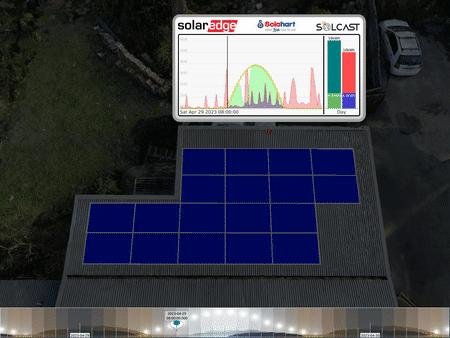
Here’s a look at John’s 3D animation pre solar install. I’m getting dizzy, so signing out now.
Footnotes
- They’re actually much more than animated gifs. John says “The whole system is very interactive so I can fly around all over the place and whizz back and forth through time to my heart’s content. Animated gifs are just a bit of a by-product.” ↩
 RSS - Posts


Very interesting, just shows the possibilities of better solar analytical software that could be available commercially to similarly interested homeowners.
Home Assistant can achieve much of what John has achieved. Even the SolarEdge Panel data can be displayed (with a disclaimer: SolarEdge only allows one Modbus client so in my Victron/SE setup, this is used. However, you can download or fetch the data from the SE site, but delayed.)
I love the 3D mapping of the roof. Very leading edge!
Awesome work John!
Thanks Corey!
Does Google 3D Tiles rely on Google Maps data? If so then that won’t work because Google Maps is years out of date and shows some new estate as green blocks or empty pastures. … though apparently their street view is somewhat more up to date.
The Google 3D Tiles dataset is the same thing that appears in Google Earth (https://earth.google.com), which is similar but not quite the same as the “Satellite” view that appears in Google Maps. There’s certainly a lot of places where there isn’t full 3D data (just coarse ground level elevation which won’t help for detailed shadow analysis), and even when it is present it can be quite out of date, as you say. But given that it can be accessed for free and it covers the whole world, I think it would often be “good enough” for doing shadow analysis for a lot of people in populated centres. It also captures far range hills and mountains, which a lot of datasets don’t.
Hi,
If it’s a new development, there probably won’t be much of a shade problem for a few years. Shade from double story houses is a different “story”.
b0b
Very interesting. John, why didn’t you add four more panels, even if sub-optimally placed? Pretty sure the inverter can be oversized to 1.5x, or were you limited by the distributor or installation rebates? Cheers
Any more panels would have incurred the need to get an additional engineering assessment due to the weight on the roof panel. In hindsight, it would have been worth doing at the time.