
Inflation is back, and the cost of living is rising. While not as bad as headlines may claim, we’ll end up a lot poorer if inflation starts to beat wage growth consistently.
Taking steps to protect yourself in an inflationary environment makes sense. If we’re in for tough times, sensible investments that reduce expenditures will help you get by. But if rosy times are coming, the same actions will help you grow richer.
Chances are you can guess what I’ll suggest as the best, low-risk step you can take to keep your cost of living down — but just because I’m predictable doesn’t mean I’m wrong. If you own an unshaded roof, installing solar panels is the best action I can think of to either keep your electricity expenditures down or provide an overall credit on your electricity bills.
This article will tell how much the average household can expect to save by installing solar in each Australian capital. What’s more, I’ll give you the tools you can use to estimate your solar energy savings and help you find the best retail electricity plan.
Specifically, these two tools:
- The SolarQuotes Solar & Battery Calculator, and…
- The SolarQuotes Electricity Retailer Plan Comparison Page
UPDATE May 27: Apologies, but the Electricity Retailer Comparison page has been taken offline for maintenance and some re-jiggering.
We’ve Worked Hard On Our Tools
While we’ve had these tools for a long time, they’ve recently had a significant overhaul, so they will work with time-of-use tariffs and not just flat tariffs as in the past.
Some very clever people here at SolarQuotes did the upgrades. So, no, I wasn’t involved.
We’re Still Working On Them
We’ve made big improvements to our tools, but changes can introduce new problems, both big and small, so we can’t promise that the results will always be perfect, or they’ll always find the best electricity plan available. What we will do is make them work as well as we can. You can use the tools right now, but they are in beta, which is a type of testing where we try to make them better. They are works in progress, and we’re improving them as we go.
The Solar & Battery Calculator – Adelaide
Adelaide is Australia’s premier state capital — according to the alphabet. For this reason, as well as the fact I live there, I’ll start the solar savings calculations in the City of Churches.

I said churches, not Lurches!
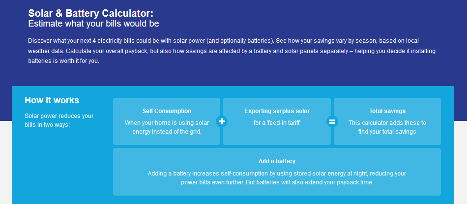
If you go to the Solar & Battery Calculator page, you’ll see this introduction at the top, letting you know what you are getting into:
After carefully reading every single word of that and committing it to memory — or not — you can scroll down and enter information that will let it estimate how much a solar power system is likely to save you.
First off is your postcode:

This is important because there is a big difference in solar energy output between Darwin and Hobart, and without a postcode, the calculator won’t know where you are.
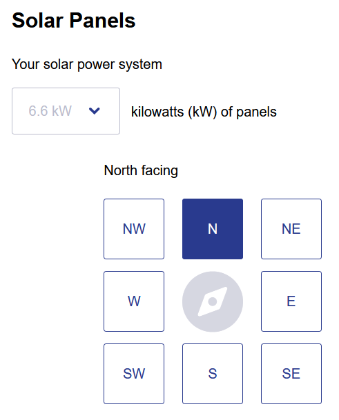
Next is how many kilowatts of solar panels the system will have, as well as the direction they’ll face:
You can also enter panels’ tilt: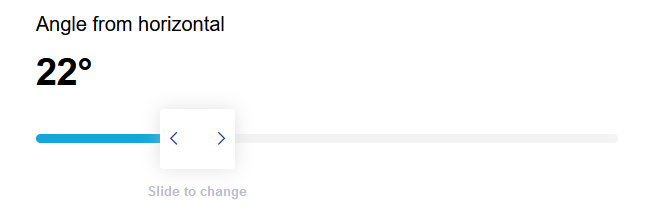 The large majority of home roofs have a tilt of either 15 or 22.5 degrees. There’s not a lot of difference in solar output between the two, so if your roof tilt looks similar to most homes you can just leave it at 22 degrees. If your roof is actually 15 degree, it will make very little difference to the result.
You can add information for more than one array of panels to get accurate results if there will be panels facing in two or more directions:

If you want a quick estimate, you can pretend all your panels face the same direction. Preferably whichever direction will have the most panels.
You can also add a battery:
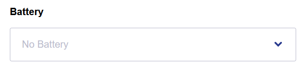
If you don’t mind paying up front for energy security, a battery can almost guarantee very low electricity bills or — depending on the size of your solar system — an electricity bill credit. But if your goal is to save money overall, then a battery isn’t likely to help at the moment unless your situation is exceptional. I won’t look into the costs and benefits of installing a battery today.
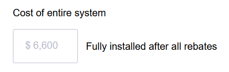
You can add the total cost of the solar power system:
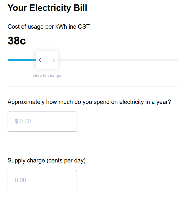
Providing details of your electricity bills will allow the calculator to estimate how much you’re likely to save:
Entering the solar feed-in tariff you will receive will also help determine your savings from solar power:
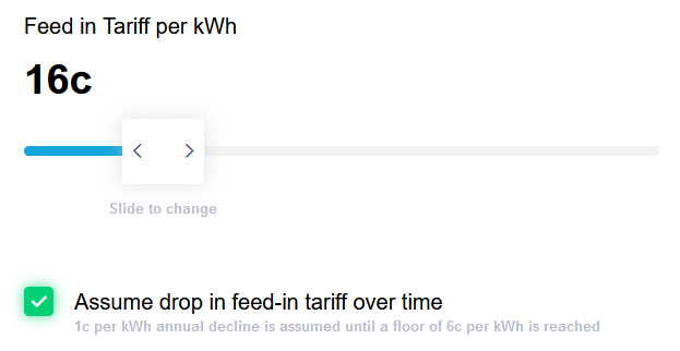
If you don’t click the green tick to unselect it, the calculator will assume your feed-in tariff will drop by 1 cent per year. In this example, it will continue until it hits 6 cents.
Finally, you can hit this button to see your estimated savings:

But What If I’m Lazy?
You might say to me…
“But I don’t wanna fill all that in. That slightly resembles effort!”
If that’s the case, the good news is, after you enter your postcode, the Solar & Battery calculator will add the default values for a typical home with a north facing solar system in your area. You don’t have to go through any more effort than clicking on “Calculate Savings” at the bottom of the page if you don’t want to and are happy with “typical” results.
Adelaide Results
If I simply enter an Adelaide postcode and leave everything else on the default values, then it will give me the first year of electricity bill savings and the simple payback period for a 6.6 kilowatt north facing solar power system that costs $6,600:
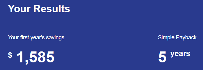
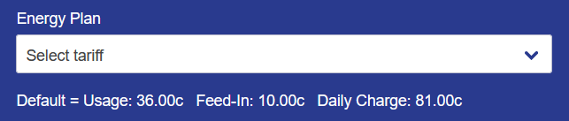
I consider that to be a damn good result. But it may be possible to do even better. This is because the calculator used the default values for the cost of grid electricity, and you may be able to find something better. You can change the default values by going to where it says “Energy Plan” and clicking on “Select tariff”.
If you are in Western Australia, there won’t be much of a choice. But the majority of Australians can either enter the name of an electricity retailer or scroll down through a list of plans, which will include the estimated first-year savings they’ll provide:
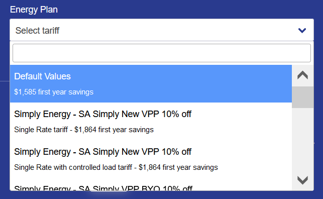
The hard part is knowing which plan to click on because the best ones usually aren’t available to most households. Unfortunately, the Solar & Battery Calculator isn’t smart enough to know which plans are available and which ones have special conditions attached. It’s not the calculator’s fault. Electricity retailers often make their plans confusing and often try to include sneaky conditions to rip people off.
For example, for Adelaide the first plan below the “Default Values” is:

This plan requires you to have a suitable home battery and participate in their Virtual Power Plant (VPP). Not many people have a home battery system, and even among those who do, not all are prepared to allow an electricity retailer to have their way with it.
If you want to find an electricity plan that…
- Will save you money
- Is available for your household to use and…
- Doesn’t have sneaky conditions designed to rip you off
Then you need to use another online tool that will give you all the relevant information you need. Our Electricity Retailer Comparison Page, which I’ll describe below, is our attempt to do this. You can use it to find a plan, check that it’s suitable for you, and then — if you want to be thorough — you can check if you can select it in our Solar & Battery Calculator for a detailed breakdown of the savings it provides.
Alternatively, you may find that just checking the retailer comparison page is enough to decide which plan you want.
Electricity Retailer Comparison Page
Our Electricity Retailer Plan Comparison Page (UPDATE: May 27: apologies, but we’ve needed to take the comparison page offline for the time being while we carry out some work on it) is easy to use, especially if you stick to using the simple version:

If you’re feeling lazy, all you need to do is enter your postcode and solar system size:

The comparison page will then estimate how much electricity homes with solar panels consume, but note it’s for a large family and not a typical household, so odds are you’ll want to crank it down. Further down, I’ll give you typical figures for how much households in each capital consume.
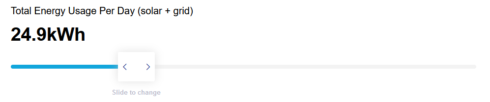
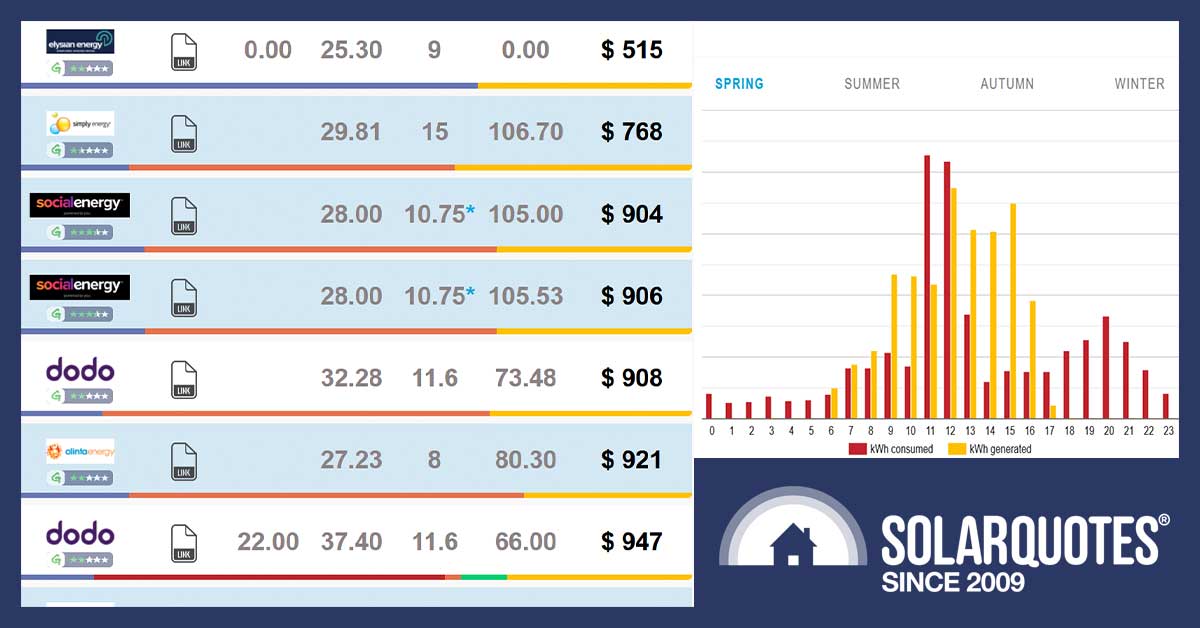
Then the Retailer Plan Comparison Page shows a long list of retail electricity plans and an estimate of what you can expect to pay annually. Here are the first 9 retail plans shown for an Adelaide home with a 6.6 kilowatt solar system with “Total Energy Usage Per Day (solar + grid)” left at the high default value:
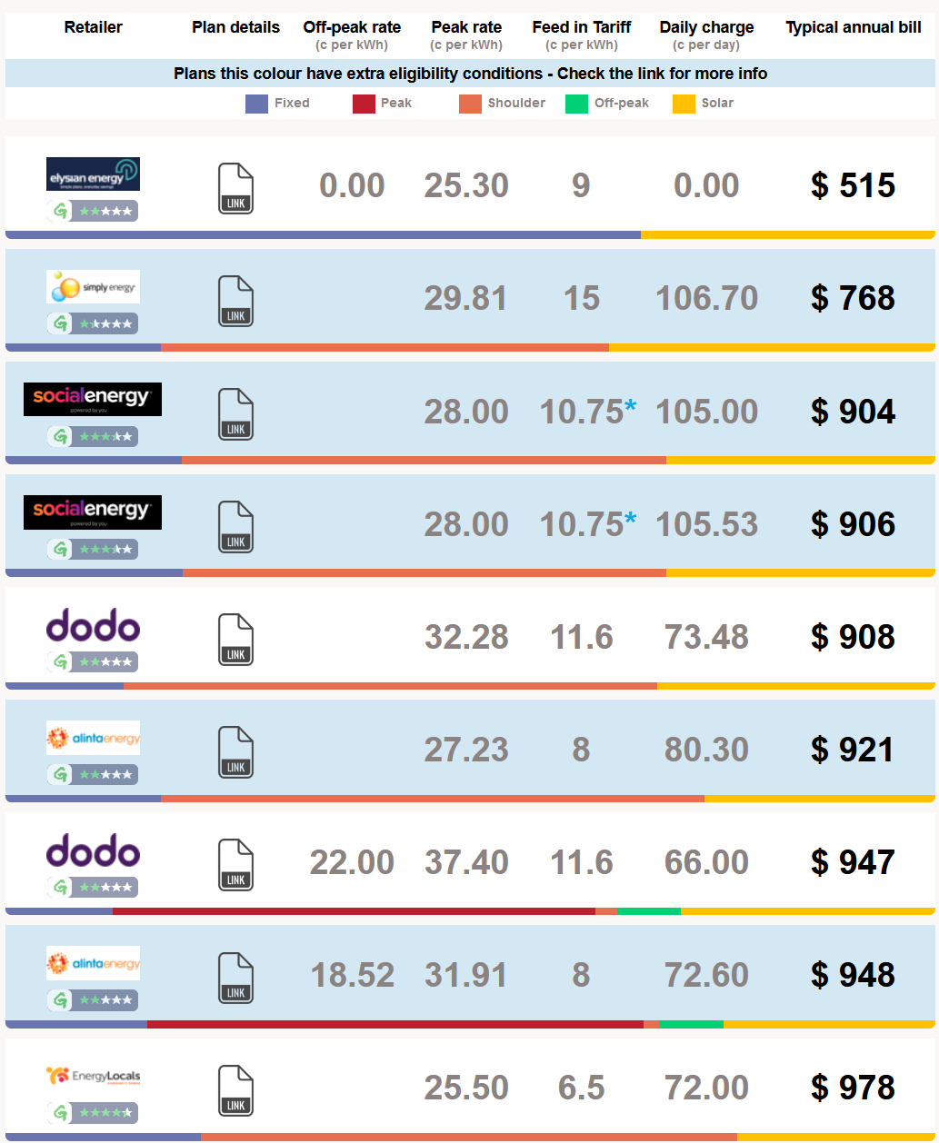
The full list of plans shown for Adelaide is longer than this. At the moment, it will present 175 different plans.
Retail plans with special conditions that may make them unavailable to all households are highlighted with a blue-grey background. Sometimes the conditions are deal-breakers for most homes, such as requiring a battery. Other times they are milder, such as only allowing a solar system of 10 kilowatts or smaller — or possibly under 10 kilowatts. But even if you choose a plan without this highlight, you will still need to click on the link symbol:

This will bring up the plan’s details and let you check it is suitable for you. Looking at the details of the first plan shown for Adelaide, I see it is quite sneaky and only suitable for homes with extremely high grid electricity consumption, making it unsuitable for the vast majority of solar households. I’ll take note of this, and we will probably make a change soon. As mentioned, it is a work in progress.

Adjusting Electricity Consumption
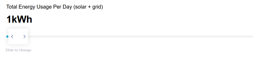
There’s no need to stick with the default energy consumption on the Electricity Retailer Comparison Page. You can adjust it, so it’s implausibly low…
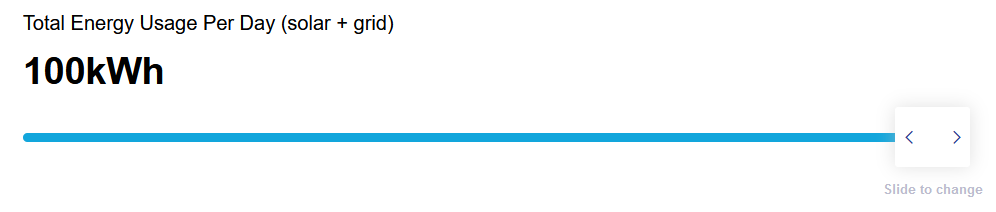
 …or horribly high:
But average total daily electricity consumption for a home with a 6.6 kilowatt solar power system is:
- Adelaide: 12 kilowatt-hours
- Brisbane: 12 kilowatt-hours
- Canberra: 12 kilowatt-hours
- Darwin: 15 kilowatt-hours
- Hobart: 14 kilowatt-hours
- Melbourne: 11 kilowatt-hours
- Perth: 14 kilowatt-hours
- Sydney: 11 kilowatt-hours
You can either check your electricity bills to determine your actual consumption or if you think it’s likely to be fairly average, you can use the figures above. The positions of electricity plans will shift according to the figures used. Note that the average Australian household only has 2.6 people, so if your home has four or more people, you’ll use considerably more than the averages above.
Electricity Usage Profile
You can also adjust your usage profile. This will change how the page assumes your home consumes electricity throughout the day. You can click on the following options:

If you click on “View Usage Profile”, it will present a graph showing how it assumes your home, on average, consumes electricity over 24 hours. Below is a chart for an Adelaide home with a 6.6 kilowatt solar system where people are usually at home during the day, a reverse cycle air conditioner is used for heating and cooling, and a standard electric hot water system is used:
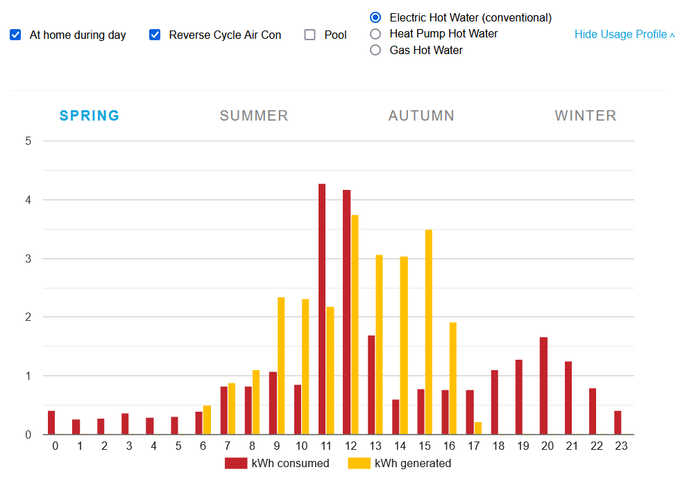
Note if you have an electric hot water system — either conventional or a heat pump system — the page assumes you will use it to heat water during the day.
Advanced Version For Higher Accuracy
So far, I’ve described the simple version of the comparison page, but if you only want to compare fixed tariff plans and don’t mind entering some extra information, you can click on the “Advanced” option near the top of the page to improve accuracy:

This will allow you to add the following additional information:
This assumes you already have a solar power system that has been providing energy for a year or more. This makes it less useful if you plan to get a system, but you can always estimate if you want.
It’s Worth Finding The Right Electricity Plan
Some exceptionally inertia-prone people may consider having to spend entire seconds using the Retailer Plan Comparison Page to be an excessive amount of effort, but these seconds can be very worthwhile. For an Adelaide household with average electricity consumption, the difference between the estimate annual cost of the cheapest and most expensive plans available to all homes with 6.6 kilowatt solar systems comes to $896. Here’s what the estimated annual electricity bills look like:

Even if you only end up saving $100, it is still worth the effort — unless you earn over $6,000 an hour, in which case you may not consider spending a minute to save $100 worthwhile. But if you’re not Elon Musk or Gina Rinehart or their bastard son, I suggest checking every year.
Most Plans Change In July
Electricity retailers usually change their plans in July. While they can change from the 1st of July, it may take several weeks for all their new offers to appear. It will depend on what type of plan you have, but it is common for retailers to either raise what they charge or not pass on price decreases at this point. So I recommend checking if there is a better plan available towards the end of July.
Solar Power System Cost
I’ll now calculate the first-year savings from installing a 6.6 kilowatt solar system in every capital and its simple payback period. This is the number of years it will take to pay for itself. It’s called simple, because it doesn’t include capital costs. Because these vary between individuals, you’ll have to work out your own estimate if you want to add them in.
To work out the simple payback period, I’ll need to know the cost of the solar system. The default value the Solar & Battery Calculator uses for solar is a straight $1,000 per kilowatt of capacity. This makes a 6.6 kilowatt system $6,600.
While getting the cheapest solar system you can find is a bad idea, it’s possible to get a reliable solar power system from installers we trust who do quality work for less. Because I’m writing this article for people concerned about the cost of living, I’m going to use a price that’s 9% lower than the default and assume a 6.6 kilowatt system is bought for $6,000.
Using the same price in every capital overlooks regional variation — the average cost of solar systems is higher in Darwin and Hobart and lower in Perth –, but I’ll stick to it for simplicity so we can compare the capitals.
How Much Should I Spend On Solar?
How much you spend on a system depends on your budget and preference. If you have a ton of money, I recommend getting as large a system as will fit on your roof with top of the line hardware, including solar panels with a product warranty of 25 years or more.
If your budget is limited, then I still suggest getting as large a system as will reasonably fit on your roof while still getting a reliable system from an installer who does quality work. We will only refer you to installers who provide reliable, well-installed systems if you get quotes through us, even if you request a budget solar power system. We’ll also back them up with our Good Installer Guarantee to remove any stress over whether or not you’ve chosen an installer you can trust.
Savings By Capital
I am now ready to determine the electricity plan that will provide the greatest saving for a home with a 6.6 kilowatt north-facing solar system. I will do this in the following way:
- Use the average daily household electricity consumption for a typical household in each capital: Adelaide 12 kWh, Brisbane 12 kWh, Canberra 12 kWh, Darwin 15 kWh, Hobart 14 kWh, Melbourne 11 kWh, Perth 14 kWh, Sydney 11 kWh.
- Use the electricity plan providing the greatest savings according to the Solar & Battery Calculator — if the information provided after clicking the “link” symbol indicates it’s available to all households with a 6.6 kilowatt solar system and it appears to be an honest plan without provisions designed to screw people over.
- Leave everything else at its default setting.
This gives the following first year savings for a home with a 6.6 kilowatt north facing solar power system in each capital, along with simple payback time:
- Adelaide: Dodo Power & Gas – Residential Standing (Default Market Offer) – $1,637, 3 years 11 months
- Brisbane: Alinta Energy Standing Offer – $1,348, 5 years 0 months
- Canberra: ACTewAGL Solar Plus – $1,438, 4 years 7 months
- Darwin: Jacanda Energy Everyday Home – $1,414, 4 years 7 months
- Hobart: 1st Energy 1st Solar Bonus – $1,205, 5 years 5 months
- Melbourne: Simply Energy Solar Elec – $1,282, 5 years 3 months
- Perth: Synergy Home Plan (A1) Tariff- $1,092, 5 years 4 months
- Sydney: GloBird Energy Solar Plus Residential – $2,244, 2 years 9 months
Here are the first year savings in a graph:
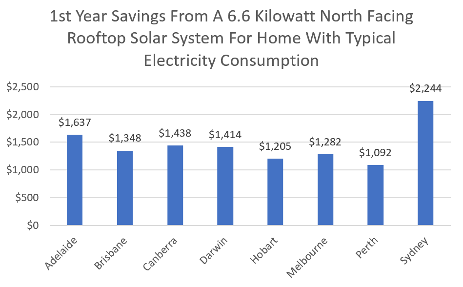
As you can see, the first-year savings in Sydney are exceptionally high. This is thanks to the GloBird Energy plan used having a solar feed-in tariff of 20 cents. This high rate surprised me, so I went to their website to double check if any special conditions were limiting its availability, but I did not see any. Still – I’m sceptical – so if anyone switched to this plan – please triple check you’ll get this feed-in-rate, and let me know how you go.
The capital with the lowest first year savings is Perth. This is due to Perth’s unfairly low feed-in tariff.
Solar System Simple Payback Period
Here’s a graph of the simple payback time, assuming the system cost $6,000:
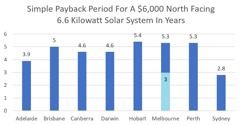
These simple payback periods assume the electricity plans stay the same. It also assumes the solar feed-in tariff will drop by one cent per year if it is above 6 cents.
As you can see, the simple payback time is under five and a half years in every capital, with the best being in Sydney.
The second best is potentially in Melbourne at three years. This is indicated by the light blue segment on the graph and is possible with the Solar Victoria panel rebate of up to $1,400. This is currently available to the majority of households without solar panels. The next shortest payback period in Adelaide, is due to a combination of high grid electricity prices and a good feed-in tariff.
The longest payback period, at 5.4 years, is in Hobart. This is understandable, thanks to it having the lowest solar electricity output of pretty much anywhere in Australia.
Less understandable for most is why Perth has the second longest payback period when it has more sunshine than any other capital. This due to its unfairly low feed-in tariff. Fortunately for Perth people, the cost of solar power is lower than anywhere else, so it is possible to get good quality solar for less than the figure used here.
Go Bigger
I’ve looked at installing a 6.6 kilowatts because they’ll generally fit on all but the smallest roofs these days. But, if you have room for more — and you’re not in Western Australia where homes with more than 6.66 kilowatts of solar panels won’t receive any feed-in tariff — then I recommend going larger where possible.
A 10 kilowatt solar system is 52% larger than a 6.6 kilowatt one but generally costs much less than 50% more. In most situations, the extra capacity will pay for itself, and it will help future proof the home for when a home battery or electric car is bought.
A Worthwhile Investment
An investment of $6,000 that’s likely to save the typical household $1,000 or more a year is an excellent deal as far as I’m concerned. The cost of electricity may not rise in the future, but if it does you’ll be at least partially protected from increases in the cost of living with solar panels on your roof.
The only better investment I can think of is paying back money you’ve borrowed from the mafia — although that’s more about the cost of not living.
Personally, I don’t think the mild inflation we’ve had lately is anything to worry about. This is because it was a far higher 15% when I was younger. Old people like me have a term for that period. We refer to it as, “the good old days”. The reason why they weren’t miserable was because — for the most part — people’s wages grew faster than inflation. So it’s not modest inflation we need to worry about, it’s incomes not keeping up.
I’m writing this on Saturday morning, so our odds of having “good new days” or “not-so-good new days” depends on how people decide to vote.
Footnote: We have released a new battery calculator which focuses specifically on the savings of adding a battery to your existing solar panel system. Enter your details along with your NEM12 file and find out your potential savings.
 RSS - Posts


This really cool and you guys have done an amazing job, well done!
Choosing the right electricity plans as a solar owner sure is complicated and changes all the time.
The average solar owner can save an additional $400 pa just by making sure they are on the right plan according to recent analysis by Solar Analytics.
In great news, Solar Analytics customers get a fully automated service to do this using real data with just a single click of a button. It’s pretty simple really.
It’s called Plan Optimiser.
Your Electricity Retailer comparison appears to have a limitation that the EnergyMadeEasy site also has right now, and that is that it doesn’t account for limits on solar feed-in-tariffs. So for me you recommend Nectar saying it’ll cost about $806 because I have a big solar system and they pay 14c per kWh. Problem is, that’s only on the first 10 kWh a day. So if I go to Nectr’s website and upload my bill, Nectr say the same plan will actually cost $2376 per year!!! A massive $1570 difference and almost 200% more than what you’re suggesting!
Yes, I’m afraid this is just one reason why it is still a work in progress. This is one problem I noticed when I put the article together. I’m afraid I have no idea whether it is something that is easy or difficult to fix.
Yeah – it’s quite difficult to fix properly (like if you were using people’s meter data and adding up their real export etc). But the “easy” fix would be to just assume on certain size systems that the maximum that can possibly be exported each day is the 10kw and then limiting the FiT to $1.40 per day. That way with plans like Nectr, you can only be subtracting a maximum of $511 from the cost for a year etc.
Honestly that does not compare apples to apples. In my postcode 2228 (Ausgrid) I have so called Seasonal ToU. It has been introduced in 2018 replacing standard ToU. It has no peak time April,May,Sept,Oct and June-Aug peak is 5PM to 9PM. Compared to standard Tou it removes peak for 5.5 monts of 12 months in calendar.
Now, as this is distributor tariff, I am billed with it by Reamped, Origin, while 1st energy and Globird will apply summer peak for 12 months overcharging. Powershop says it will apply Seasonal ToU as per meter but I didn’t try.
Yet your tool does not even ask for times. My last invoice import is 10kWh Peak, 166kWh off-peak and 125kWh shoulder. How will it compare if you ask me for total import instead?
Cost of Living rises not as bad as headlines claim? Which headlines? Do you mean the power bills will double headlines, or the vegetables have only gone up 6.1% type claims?
Perhaps it depends where you shop for food, or whether you buy basics or prepared meals, but so many things now seem to be jumping up 10%, 20%, even 30%!
Compounding the matter, risk is rising too. A community site I’m a member of has just reported that the region I live in is embargoed for insurance. Why? Because of alleged flood risks. The individual reporting the issue doesn’t live on the coast (there’s no threat of climate induced sea rise), nor are they along a major river e.g. Brisbane, nor are they on flat or low land, rather they’re near the top of a hill and metres above any risk, yet insurance may not be an option. Someone from another region noted they had a similar issue despite being 56 metres above sea level and nowhere near rivers. Could be a new insurance v continuing customer issue, but yet another headache for folk already facing rising inflation and soaring cost of living.
https://www.news.com.au/finance/money/costs/big-red-flag-power-bills-to-double-amid-rising-cost-of-living-pressures/news-story/47c2781357cc489cce29b1e0b4817ed9
https://www.abc.net.au/news/2022-05-17/act-service-providers-worried-more-canberrans-below-poverty-line/101066100
While there may not have been (m?)any great options for the election, voters appear to have opted for “not-so-good new days”.
I was actually thinking of changing plans, but with the threat of soaring power prices in the link above, this SQ article saying power prices tend to change in July, and the absolutely awful weather we’ve been having – solar yield is below two-thirds of average, I’m rethinking things. Maybe it’s better to play safe and make absolutely nothing off solar rather than risk a massive spike in prices and get hit with a huge bill???
George Kaplan,
“A community site I’m a member of has just reported that the region I live in is embargoed for insurance. Why?”
You may wish to see the Climate Council media release, dated May 3:
https://www.climatecouncil.org.au/resources/australian-homes-uninsurable-2030-climate-risk-map/
The Climate Council’s Climate Risk Map of Australia is an interactive map of climate vulnerable places in Australia. For a selected suburb/postcode, LGA or electorate, specific risks are assessed for the years 2030, 2050 and 2100 for high, medium & low GHG emissions scenarios, that include for:
* Riverine flooding;
* Bushfire;
* Surface water flooding;
* Coastal inundation;
* Extreme wind; or
* A summation of all of the above risks.
https://www.climatecouncil.org.au/resources/climate-risk-map/
I’m sorry, and I know you are trying, but the results this comparator spits out are, frankly, ridiculous.
Not one of the first 200 plans recommended comes anywhere near close to being best and the annual bill estimates shown are, at best, some light comic relief. Like wrong by thousands of $.
e.g. the top plan listed shows an annual bill of -$73 (a credit). But the actual bill with this plan would be $1600.
I would most definitely *not* recommend this comparison tool to anyone. At least not in its current form.
I’ve no idea what the “Advanced” tool does but if it doesn’t even ask me what my TOU consumption split is and makes no attempt to account for the stepped FITs in most of the recommended plans, then it’s wildly misleading.
Best of luck but it’s a mug’s game attempting to chase the multitude of pricing structures.
BTW – demand tariffs are a thing in large chunks of the country.
I’m in the Brisbane region, and my FIT is two-tiered, with first 10 kwh export receiving 14c, and anything over that receives 5c. I did a rough model of that using the existing detailed monthly data I’ve got for the previous year.
Over a whole year, the combination of those two averaged out to around 8.5 cents. That average varies a bit by quarterly bill eg, in winter quarters you might get an overall combined average of 11-12 cents, but in hotter periods its more like 7 -8
Its only an approximation of the overall FIT per kwh exported for the whole year, but at least it might give some readers some guide. ie between 8 and 9 cents FIT for the total exported in a year. My plan is an Origin one.
By 2030, 35.7% of all properties in my suburb ie one in every 3, are estimated to then be uninsurable under a high emissions scenario. That becomes 1 in 2 properties by 2050. Down on the Gold coast, some, but not all suburbs will find that 1 in 2 properties will be uninsurable by 2030.
Different insurance companies have different overall risk profiles depending on the composition of their overall insurance exposure and where its located. So, how that all plays out for each insurer and what they each do to cover themselves could vary a lot in the next few years.
Des, less than 3% by 2100 in my area – so less than 1 in every 33, and less than 1:50 at risk of flooding. Frankly climate change action is likely to do more harm in my area than climate change itself.
George Kaplan,
It seems you may be fortunate being in a location that has a lower risk profile for direct climate-induced hazards – i.e. flooding, bushfires, high winds, etc.
But your food supply may not be so secure. Per the IPCC AR6 WG2 Summary for Policymakers:
Meanwhile, Alan Kohler on last night’s (May 24) ABC finance report highlighted that the global food price index is at an all-time high.
https://twitter.com/AlanKohler/status/1529033117222457345
Plenty of my posts seem to vanish so this may not get past the moderators, but there’s yet another article about energy bills set to soar:
https://www.news.com.au/finance/money/costs/cost-of-living-crisis-energy-bills-to-increase-as-much-as-130-per-cent/news-story/323c8c4e21c52cb728bed7f64547fe23
Sorry George. One comment was too far off topic while another had a defective link in it.